


[At the end :] Cy finist ce present Livre, avec Laddition de Treze diverses facos de Lettres, Et la manière de faire Chiffres pour Bagues dor, ou autrement. Qui fut acheve dimprimer Le mercredy. xxviij. Iour du Mois Dapuril. Lan Mil Cincq cens. XXIX. Pour Maistre Geofroy Tory de Bourges… Et pour Giles Gourmont aussi Libraire demorant au dict Paris… [28 avril 1529].
Small folio of (8) and (80) leaves, slight restoration in the margin of the title-page, red morocco, decoration with small tools inside gilt fillets, spine ribbed and decorated, gilt inner border, gilt edges. Binding signed by Chambolle-Duru around 1865.
245 x 169 mm.
« Rare and much sought-after first edition of this brilliant work, the masterpiece of G. Tory and one of the most beautiful books of all times. It is illustrated with xylographic reproductions of the various alphabets, writing models, flowered letters, interlaced figures and numerous woodcut figures. » (Jacques Guérin).
By the extent of his curiosities, by the variety of his skills (bookseller, typographer, artist and engraver, philologist and translator), Tory embodies well the innovative vigor of the humanist spirit. Born in Bourges, from a family of farmers, he first undertakes a university career, exploiting all the resources of a double stay in Italy, before devoting himself passionately to book creation in all its forms.
The printing shop foreman Protée, bookseller-publisher “rue Saint-Jacques, à l’enseigne du Pot Cassé”, is the first to dissert on his art “Le Champ Fleury is not only a treatise devoted to typography or to the aesthetics of the book, it is moreover a manifesto, twenty years before that of Du Bellay, which purpose is to exalt the merits and the dignity of the French language”.
Tory tries to establish a relationship between letters and the proportions of the human body (considered as a measure of all things). The treaties of Pacioli and Alberti inspired this picturesque dogmatism. More decisive is his action to give the coup de grâce to the old gothic alphabets in favor of the Roman character. To do this, he designed alphabets of an elegance never surpassed. It is necessary, he says, “escripre en françois comme François nous sommes“; hence his concern to codify the grammar. He demands the use of the acute accent, the apostrophe, the cedilla that his disciple Garamond and Robert Estienne will introduce according to his wishes. His remarks on the phonetics of the patois (picard, lyonnais, berrichon, parisian…) contributed to the history of the language and made him a pioneer in dialectology.
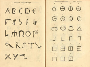
“If the Champ Fleury is one of the most famous books of the French Renaissance, it is because the book is the visual archetype, where the theorist implemented a new architectural conception. Indeed, the book vividly illustrates the expression of an order that is both balanced and subtle, free of Gothic influences and the manuscript tradition. It is illustrated with about a hundred woodcut compositions: diagrams, capital letters, and thirteen plates of alphabets and models of interlaced or fanciful letters. By their charm and interest, the most remarkable figures are the Gallic Hercules, the Triumph of Apollo and the muses, and the illustrious mark “au Pot Cassé” placed in a large Renaissance frame. Jean Perréal and Godefroy le Batave, painters and illuminators attached to King François I, contributed to the illustration, which can no longer be attributed entirely to Tory as it once was. On the other hand, we could give him back the printing of the work itself, which would later earn him the coveted title of “Printer to the King”, which Francis I had not yet granted to anyone.
In old French, Champ Fleury means Paradise. The admirable awakener that is Geofroy Tory invites the reader in this Garden of Plaisance of a gushing greenness where swarm all kinds of the most precious and the strangest flowers”.
(Ghislaine Quentin).
«It is the first didactic work written in French language. Geoffroy Tory wanted to lay the foundations of a new French grammar (he proposed the use of apostrophes, accents and the cedilla) and to create fixed rules for the manufacture of the printing characters. It is under the influence of the Champfleury that the gothic letters were abandoned; one will remember that Garamond was a student of Geoffroy Tory. “(Jacques Guérin).
“The apology of the French language, the exhortation to use it in preference to Latin, hold a great place there. Tory tried to simplify, even to establish, certain rules of grammar and pronunciation: his colourful advice Au lecteur, which Rabelais copied in part in his Discours du beau parleur limousin, deals, among other things, with the pronunciation of words by foreigners or provincials. Tory’s work predates Du Bellay’s Deffence et Illustration de la Langue françoyse by twenty years and precedes by ten years the Edict of Villers-Cotterêts of Francis I, which made the use of French in state documents compulsory. It has considerable appeal and stands out as an original work reflecting a keen artistic concern. Tory’s culture and taste have imprinted on the productions associated with his name the mark of a personal and endearing style. It is next to Tory, and perhaps benefiting from his influence, that the most elegant printers of his time were formed, like the perfect Janot, Augereau, Pierre Vidoue and the remarkable Simon de Colines to whom, besides, Tory will address in 1530 to print his Aediloquium“. (Pierre Berès).
“The illustration, which is entirely by Tory’s hand, includes demonstrative figures on the construction of capital letters, 11 plates of alphabets and models of figures and interlaced letters. The most remarkable figures are: on l. 3 v°, a beautiful vignette of the Gallic Hercules, dated 1526. The author indicates that he saw this ‘fiction in rich painture in Romme’ and that he made a drawing of it. On l. 22 v°, a beautiful figure of a naked man; on l. 29 v°, two exquisite vignettes representing the Triumph of Apollo and the Muses, and that of Ceres and Bacchus; on l. 63 v°, an emblematic figure of the Y that the author comments on and dedicates to the lovers of virtue; on l. 65, the letter Z surmounted by a genius holding a sceptre and a crown” (Brun, Le Livre français illustré de la Renaissance, 304).
This first edition is among the most sought-after of the 16th century. The Jacques Guérin copy in a rubbed contemporary binding was sold for nearly 700,000 FF (about 106,000 €) 37 years ago (Tajan, March 29, 1984, n° 97) and sold again 950,000 FF by Pierre Berès 33 years ago (1988, n° 96).
Twenty-six years ago, the Schaefer copy, “rebacked and cracked” was sold for £ 78,000 (€112,000).
Since that date, two new copies have appeared on the market; the first one bound by Godillot, a mediocre 20th century bookbinder, sold for nearly € 60,000 26 years ago; the second one, bound in damaged 19th century calf “rebacked”, sold for € 100,000 24 years ago (Christie’s June 25, 1997, lot 144).
A precious copy with wide margins, preserved in its elegant binding by Chambolle-Duru, coming from John Fleming and Arthur and Charlotte Vershbow libraries sold for $60,000 by Christie’s New York in 2013.